<button>
<button>是一个预设常用按钮。
子组件
无
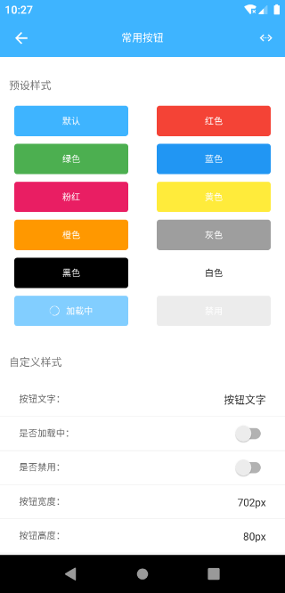
预览效果
示例代码
<template>
    <div class="app">

        <scroller class="list">

            <text class="list-title">预设样式</text>

            <div class="list-item">
                <button class="button" text="默认"></button>
                <button class="button" text="红色" model="red"></button>
            </div>

            <div class="list-item">
                <button class="button" text="绿色" model="green"></button>
                <button class="button" text="蓝色" model="blue"></button>
            </div>

            <div class="list-item">
                <button class="button" text="粉红" model="pink"></button>
                <button class="button" text="黄色" model="yellow"></button>
            </div>

            <div class="list-item">
                <button class="button" text="橙色" model="orange"></button>
                <button class="button" text="灰色" model="gray"></button>
            </div>

            <div class="list-item">
                <button class="button" text="黑色" model="black"></button>
                <button class="button" text="白色" model="white"></button>
            </div>

            <div class="list-item">
                <button class="button" text="加载中" loading="true"></button>
                <button class="button" text="禁用" disabled="true"></button>
            </div>

            <text class="list-title">自定义样式</text>

            <div class="list-input-item">
                <text class="cell">按钮文字:</text>
                <input class="input" placeholder="文字" v-model="text"/>
            </div>

            <div class="list-input-item">
                <text class="cell" style="flex:1">是否加载中:</text>
                <switch class="switch" :checked="loading" @change="loading = !loading"></switch>
            </div>

            <div class="list-input-item">
                <text class="cell" style="flex:1">是否禁用:</text>
                <switch class="switch" :checked="disabled" @change="disabled = !disabled"></switch>
            </div>

            <div class="list-input-item">
                <text class="cell">按钮宽度:</text>
                <input class="input" placeholder="自定义样式实现, 默认全屏"
                       v-model="width"/>
            </div>

            <div class="list-input-item">
                <text class="cell">按钮高度:</text>
                <input class="input" placeholder="自定义样式实现, 默认高度80px" v-model="height"/>
            </div>

            <div class="list-input-item">
                <text class="cell">背景颜色:</text>
                <input class="input" placeholder="自定义样式实现" v-model="backgroundColor"/>
            </div>

            <div class="list-input-item">
                <text class="cell">边框颜色:</text>
                <input class="input" placeholder="自定义样式实现" v-model="borderColor"/>
            </div>

            <div class="list-input-item">
                <text class="cell">边框圆角:</text>
                <input class="input" placeholder="自定义样式实现,默认8px" v-model="borderRadius"/>
            </div>

            <div class="demo-item">
                <button class="demoButton" :eeui="eeuiStyle" :style="demoStyle"></button>
            </div>

        </scroller>


    </div>
</template>

<style scoped>
    .app {
        width: 750px;
        flex: 1;
        background-color: #ffffff;
    }

    .list {
        width: 750px;
        flex: 1;
    }

    .list-title {
        margin-top: 24px;
        margin-bottom: 12px;
        padding-top: 36px;
        padding-right: 24px;
        padding-bottom: 24px;
        padding-left: 24px;
        font-size: 28px;
        color: #757575;
    }

    .list-item {
        width: 750px;
        flex-direction: row;
    }

    .button {
        font-size: 24px;
        margin-left: 37.5px;
        margin-right: 37.5px;
        margin-bottom: 20px;
        width: 300px;
        height: 80px;
    }

    .list-input-item {
        width: 750px;
        height: 90px;
        flex-direction: row;
        align-items: center;
        border-bottom-color: #e4e4e4;
        border-bottom-style: solid;
        border-bottom-width: 1px;
    }

    .cell {
        padding-left: 50px;
        font-size: 24px;
        color: #666666;
    }

    .switch {
        margin-right: 40px;
    }

    .input {
        padding-right: 50px;
        flex: 1;
        height: 90px;
        text-align: right;
        font-size: 28px;
    }

    .demo-item {
        width: 750px;
        padding-top: 30px;
        padding-bottom: 30px;
        align-items: center;
    }

</style>

<script>
    const eeui = app.requireModule('eeui');

    export default {
        data() {
            return {
                text: '按钮',
                width: '702px',
                height: '80px',
                loading: false,
                disabled: false,
                backgroundColor: '#FF5000',
                borderColor: '#FF5000',
                borderRadius: '8px',
                fontSize: '28px',
                color: '#FFFFFF'
            }
        },
        mounted() {
            this.$nextTick(() => {
                this.text = '按钮文字';
            });
        },
        computed: {
            eeuiStyle() {
                const { backgroundColor, borderColor, borderRadius, text, color, loading, disabled } = this;
                const customStyle = {};
                if (backgroundColor) {
                    customStyle.backgroundColor = backgroundColor;
                }
                if (borderColor) {
                    customStyle.borderColor = borderColor;
                    customStyle.borderWidth = "1px";
                }
                if (borderRadius) {
                    customStyle.borderRadius = borderRadius;
                }
                if (text) {
                    customStyle.text = text;
                }
                if (color) {
                    customStyle.color = color;
                }
                customStyle.loading = loading;
                customStyle.disabled = disabled;
                return customStyle;
            },

            demoStyle() {
                const { width, height } = this;
                const customStyle = {};
                customStyle.width = width;
                customStyle.height = height;
                return customStyle;
            }
        },
    };
</script>
配置参数
| 属性名 | 类型 | 描述 | 默认值 |
|---|---|---|---|
| text | String | 按钮文字 | - |
| color | String | 按钮文字颜色 | #FFFFFF |
| fontSize | Number | 字体大小 | - |
| backgroundColor | String | 按钮背景颜色 | #3EB4FF |
| borderRadius | Number | 圆角半径 | 8 |
| borderWidth | Number | 边框大小 | 0 |
| borderColor | String | 边框颜色 | - |
| disabled | Boolean | 是否禁用 | false |
| loading | Boolean | 是否加载中 | false |
| model | String | 预设风格,详细注① | - |
注①
red:红色;green:绿色;blue:蓝色;pink:粉红;
yellow:黄色;orange:橙色;gray:灰色;black:黑色;white:白色;
例如:
<button
    ref="reflectName"
    class="button"
    text="红色" model="red"></button>
事件回调 callback
/**
 * 组件加载完成
 */
@ready = function() { ... }
调用方法 methods
/**
 * 设置按钮文字
 * 参数一:按钮文字
 */
this.$refs.reflectName.setText('文字');

/**
 * 设置按钮文字颜色
 * 参数一:颜色代码
 */
this.$refs.reflectName.setTextColor('#FF0000');

/**
 * 设置按钮字体大小
 * 参数一:字体大小
 */
this.$refs.reflectName.setTextSize(20);

/**
 * 设置是否禁用
 * 参数一:true|false
 */
this.$refs.reflectName.setDisabled(true);

/**
 * 设置是否加载中
 * 参数一:true|false
 */
this.$refs.reflectName.setLoading(true);